Manchester United Logo Evolution.
Change is a constant thing in life, and no matter how we like something when it gets to a point, the look of the thing might get dull due. This is also applicable to humans. We do exercise, take good care of our body to look good and smart always. This means if we live without taking care of our self, we will look fade and old. So every good thing we do to our selves to look smart is a means by which we change the version of our look. I have seen many companies changing the version of their logo, and as a lover on Man United, I searched through the past logo and I was wowed how everything got started.
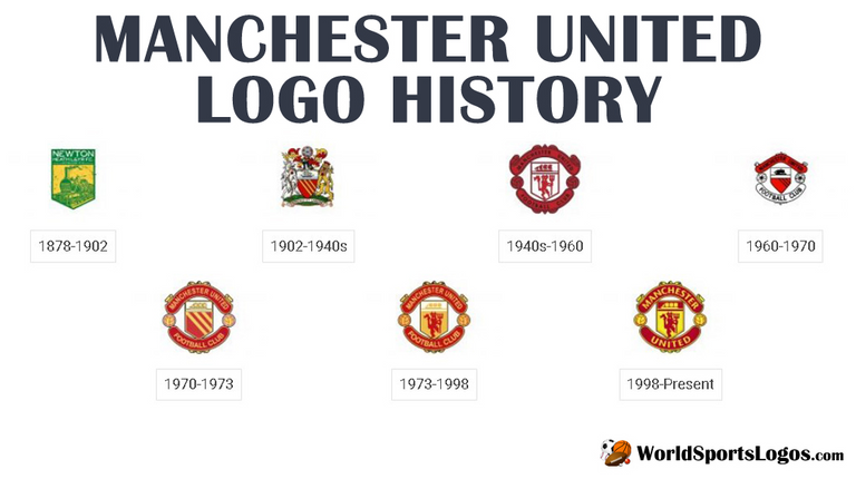
So in the 1878-1902 Man United was Green. I imagine what the colour of the jersey would be then. I bet it will be green as the logo was green. And as shown in the image, surely, the name wasn't Manchester United. The image is kinda blurred but I can see Newton Heath L&YR F.C. I believe some of the Man United fans may no know that Man United was Newton Health L&YR F.C before now. If you are reading this, now you know.
The changes on 1902-1940 are pretty confusing, as it seems the Team name changed as well. The colour contains red and yellow and green. This shows some changes were already happening on the team. But the main Evolution of this era logo starts in 1940.
1940-1960 The logo clearly shows the Name of the Club in the same circular form as it is now. But the red is too deep and the match with black made it hard to see in the eye. But the inclusion of the Red Devil holding the evil fork joined in this era. And the two balls at the two wings were also there.
1960-1970. This ten years changed everything again. The red devil logo was not included in the image. But is still show that it is Manchester United as the name is written on the image. The ball was still there in this period but this time it was white. I think this is the worst logo in the history of Man United logos. It does not look Catchy at all. The choice of the team then must be really poor.
1970-1973 So, Man United used this nice version with no Red devil. They must have forgotten about their Red devil Logo in the centre of the logo that year, but the logo still looks good without it. They switched back to include the devil in the centre in 1973.
So, 1973-1998. Man United picked back the Red devil in the centre of their logo with little changes in the logo. There ins't much changes in the logo than the inclusion of this devil. And in 1998 till date, The only changes is the slight change in the colour.
These are the changes on the color of Manchester United's logos, and if you don't know about this before, now you know. Thanks for reading through.
Hi, @darewealth!
You just got a 1.11% upvote from SteemPlus!
To get higher upvotes, earn more SteemPlus Points (SPP). On your Steemit wallet, check your SPP balance and click on "How to earn SPP?" to find out all the ways to earn.
If you're not using SteemPlus yet, please check our last posts in here to see the many ways in which SteemPlus can improve your Steem experience on Steemit and Busy.